Make Space
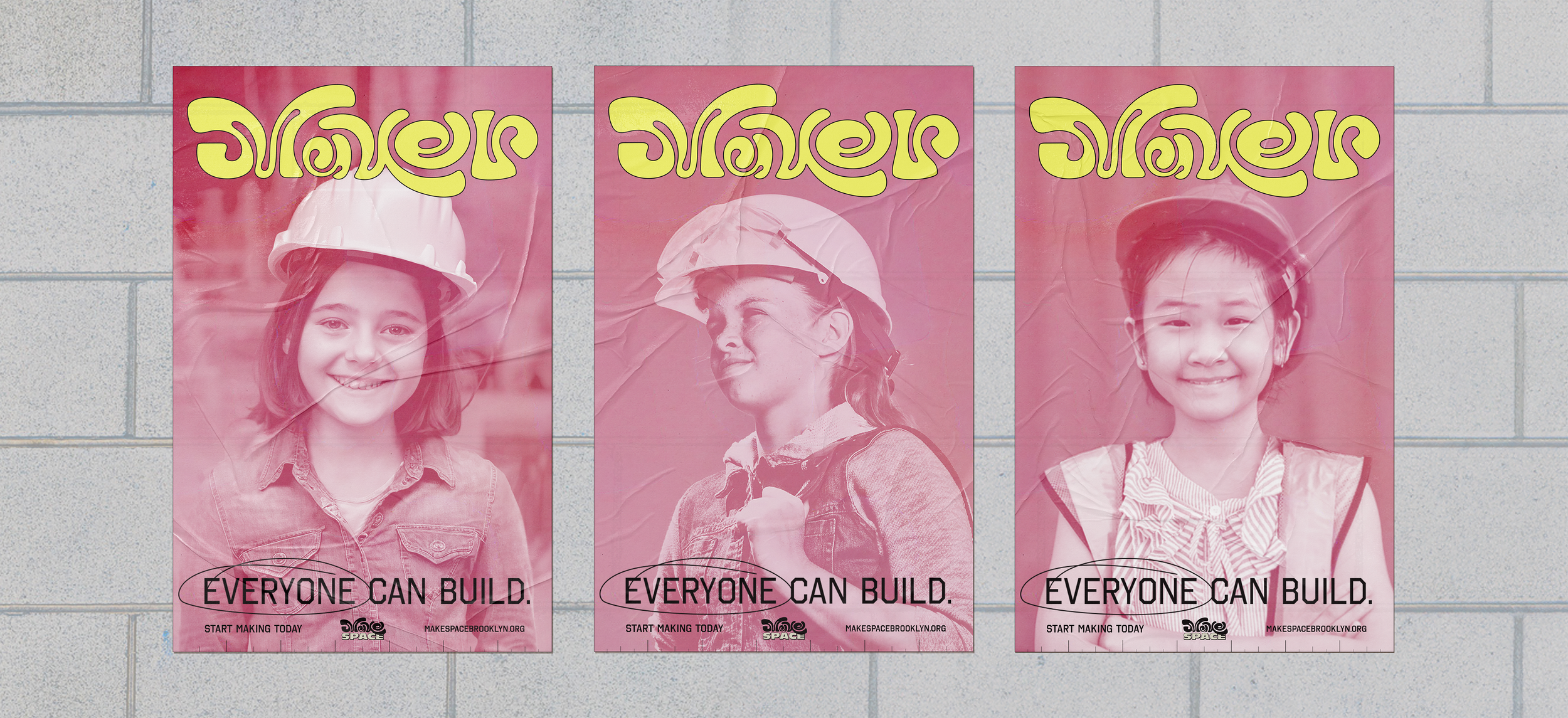
As a radically gender-inclusive space, we wanted to push beyond both obvious STEM-centric aesthetics and overly heteronormative ideas of young femininity to capture a narrative of continuous growth, confidence and audacious curiosity.
The colors were chosen to give a sense of boldness and playfulness. There was a deliberate choice to celebrate “girlhood” without relying on tropes of an overly feminine palette.
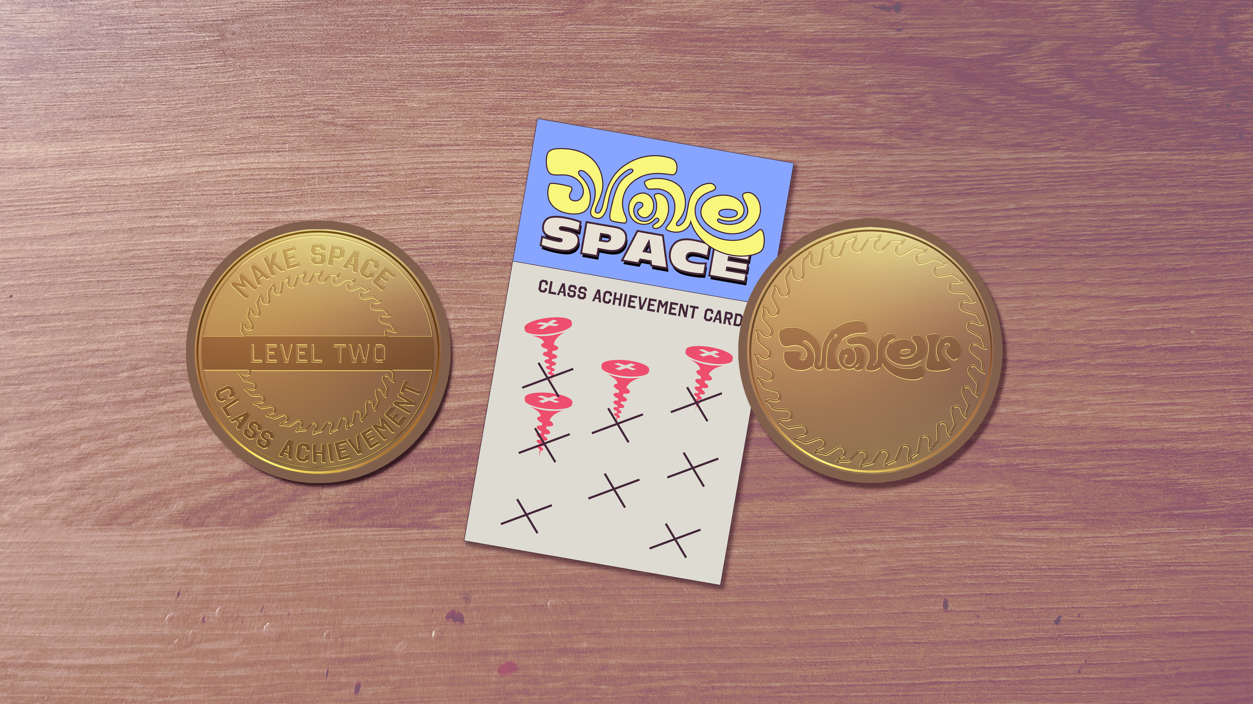
We drew from elements of drafting vernacular do develop a UI system that expresses distinctly creative touch and, appearing again and again throughout the system, become more meaningful as our young members encounter them over the course of their education.
Pink rosin paper is commonly used to cover work tables. The durable paper protects the work surface while often accumulating residue from various projects creating expressive and serendipitous textures. We have included these overlays in our design system as a monument to error as opportunity and the fresh start at the beginning of each new project.
Brand & Identity System
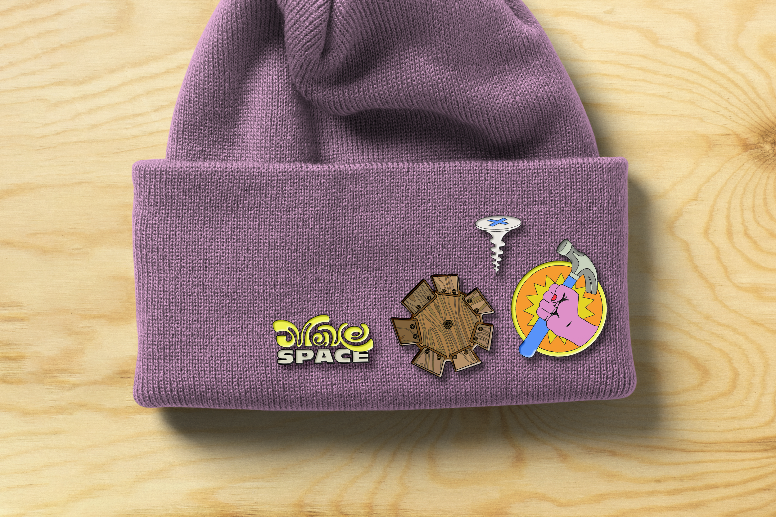
The resulting system is a silly, irreverent and meticulous, heroic portraiture and bold colors, embellished throughout with playfully textured accents.


